Case Study
Temptraq
UX Audit • UX Research • UI Design
A temperature monitoring system
Platform
Web, tablet
iOS
Industry
Healthcare
Deliverables
UX Research
UI Design
UX Audits
Design QA
Timeline
Start: March 2023 - End May 2023
Objectives
Create a user-friendly onboarding patient portal on the mobile app
Warning alerts for potential fever spike on both web and mobile app
How to review & clear list of activities for healthcare practitioners that are not conducting medical trials on the web app
Overview
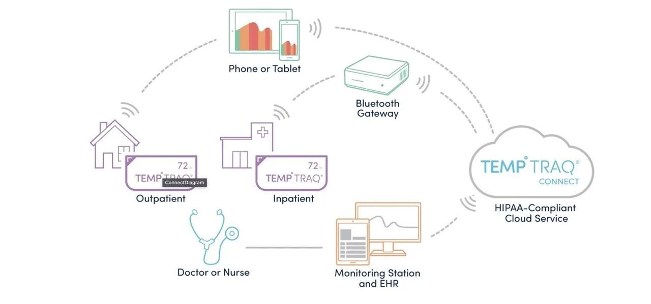
Temptraq provides an affordable, wearable technology that aims to improve the standard of care in hospitals and enhance data collection capabilities in clinical trials.
For hospital-admitted patients, temperature is the only vital sign not typically continuously monitored outside of the ICU. When temperature is taken only every four hours, what begins as an incremental change can quickly become a dire situation.
Design
My team’s goal was to design a clear application that included readable charts and graphs, scannable data, and clear actions for complex workflows.
Strategy
Understand the user’s sensibilities, desires, and core objective when monitoring vitals via user interviews
Create an efficient flow to maximize understanding among new patients
Provide customized flows for patients, and healthcare providers
Process
When executing an UX Audit on an existing platform, we familiarize ourselves with the process as if we were first-time users, this influences our new design for user flows. We began by conducting interviews with 4 different types of users: the new user as a patient, the new user as a practitioner, and the new user as a medical trial conductor, as well as speaking to the users that have used the tool in the past. Based on the learnings of the interviews, we created our personas: patient: inpatient and remote; clinical practitioner: nurse, doctor, pharma; and admin, all of which serve different roles and use expectations. The 2 different applications include the Inpatient flow and the outpatient flow.
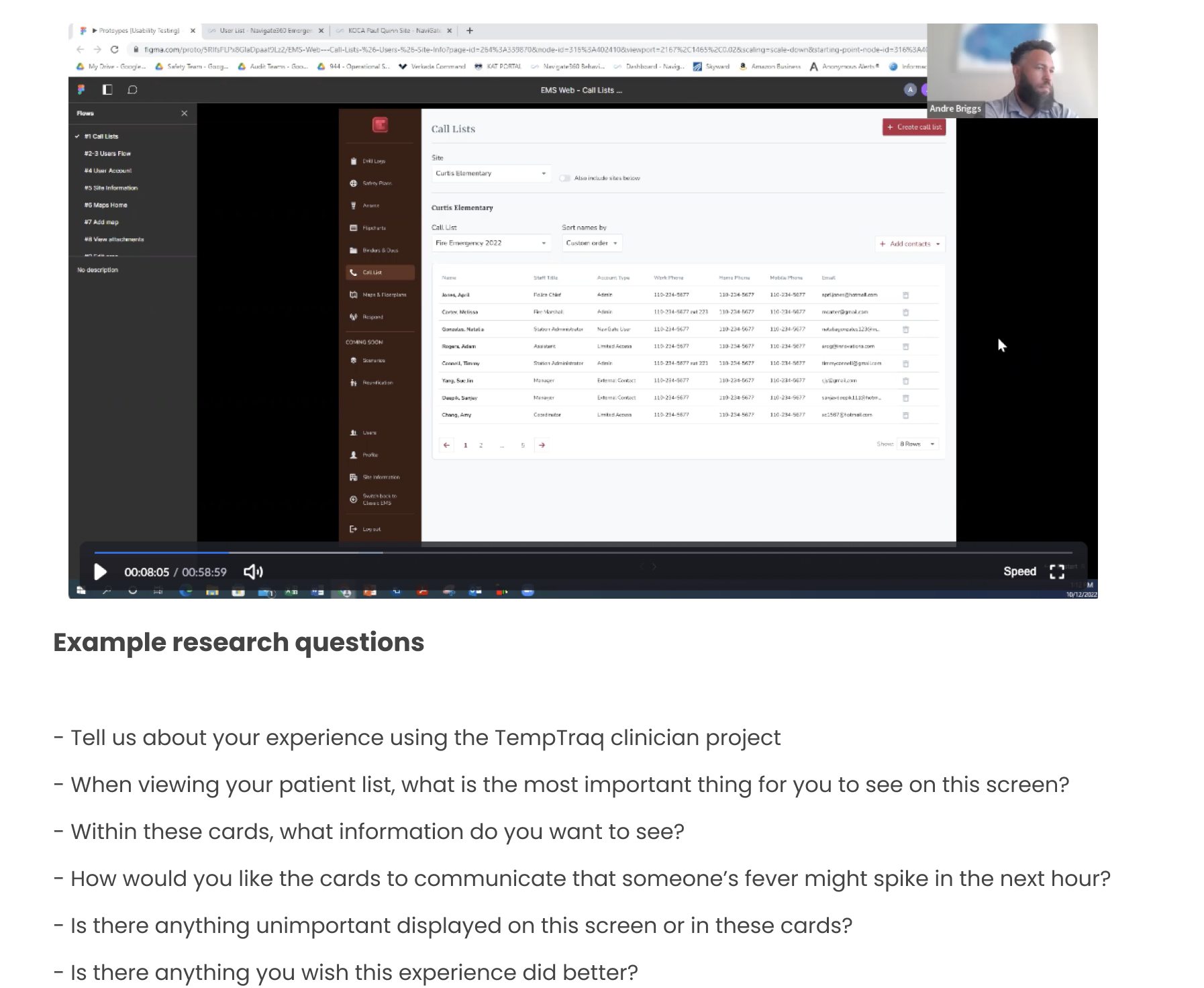
UX Interviews
4-6 sessions (2-3 weeks)
Talking with potential users of each application helped us understand how they think, what they prioritize, and how they’d like to interact with these features. This will also provide a list of other design elements and features we could consider for future projects.
UX Audit
We examined the existing user journeys to reveal actionable areas of improvement such as:
Layout and hierarchy inconsistencies
Outdated content
Customer journey bottlenecks and roadblocks
Usability and accessibility
Usability heuristics

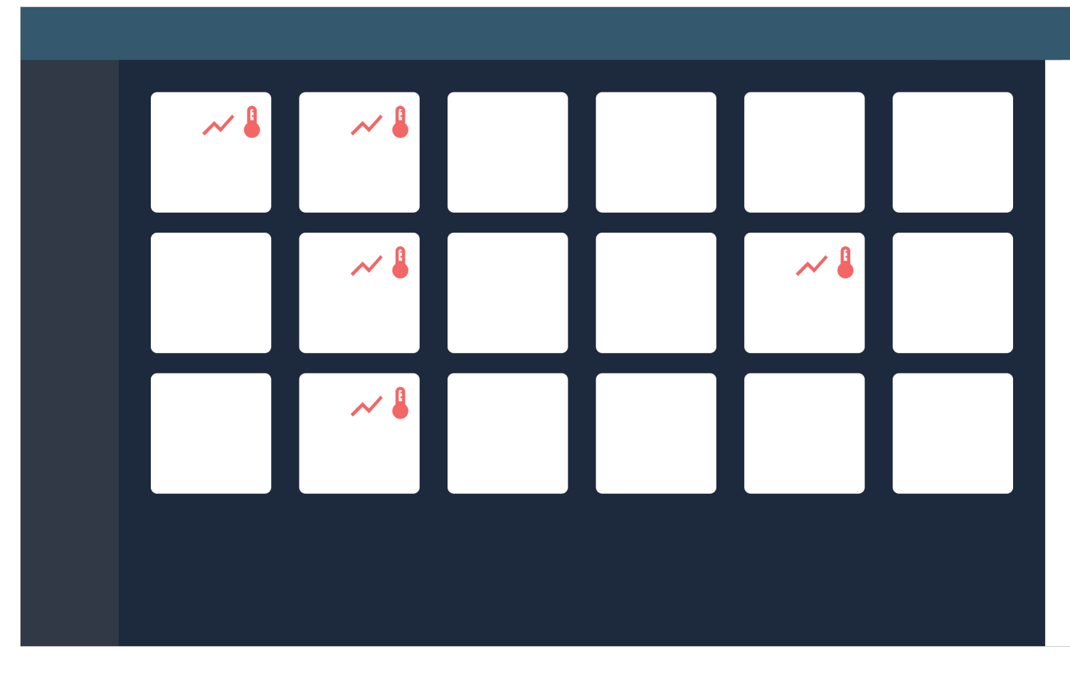
First version of web app dashboard
Having spoken to existing users of the platform informed us on aspects of the dashboard that were initially confusing like the color assignments to the dashboard tiles. The different numbers and the prioritization of data in each tile. From there, we created a list of must-haves like current temperature, status, and patch battery.
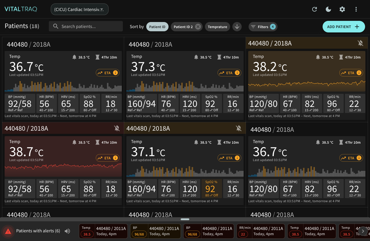
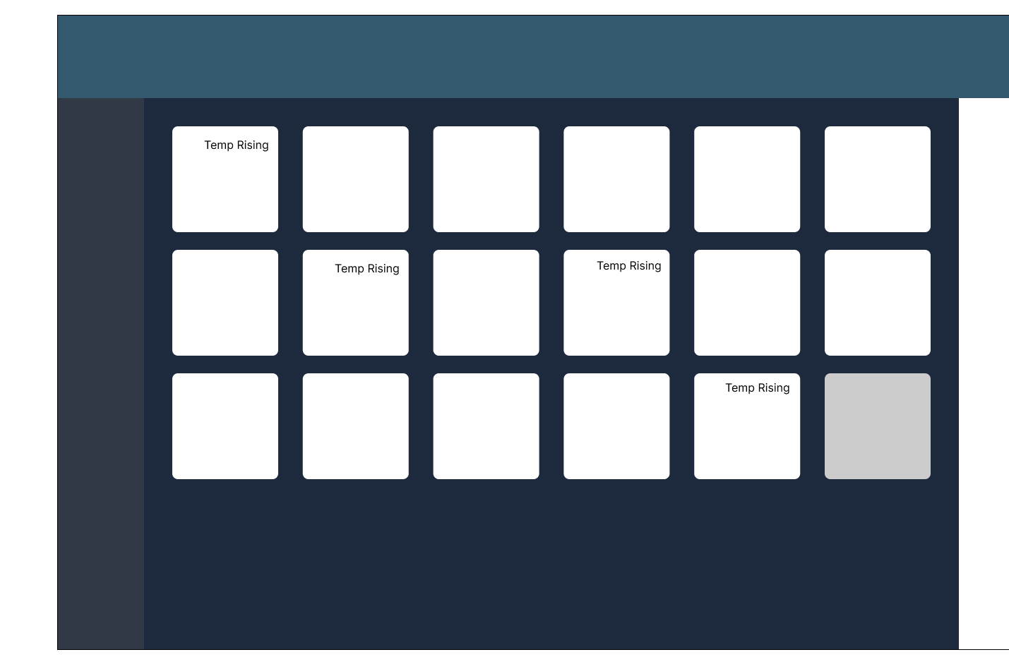
Redesign of web app dashboard
Our finalized designs consisted of a dark mode web app for clinicians and pharma providers that provided sorting and filter capabilities as well as patient temperature alerts. We found out that the ability to scan data quickly was the biggest request, as well as seeing a patient’s vital trends.
Ideation
Text
More obvious than icons, but text can add too much data on a crowded tile could have made the experience too cluttered and hard to see at a glance.
IcoN
Being careful to not rely solely on icons to communicate fever state, icons served as a helpful starting point for a crowded element.
Grouped
Grouped tiles helped bring hierarchy and priority to the most important tiles based on user preference. This, paired with icons or text, was a useful way to communicate important contextual changes.

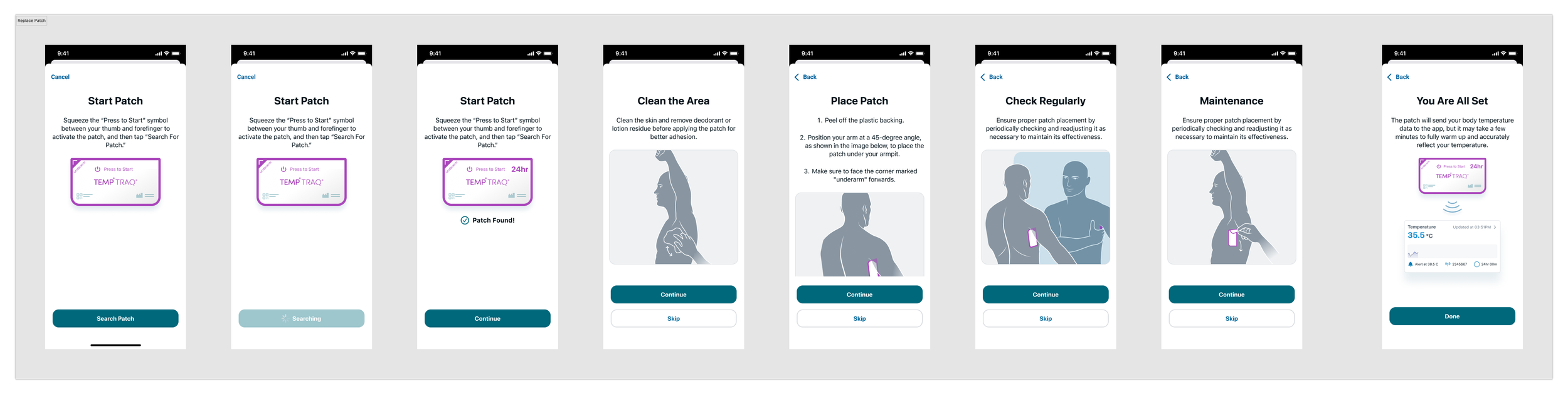
High Fidelity Designs
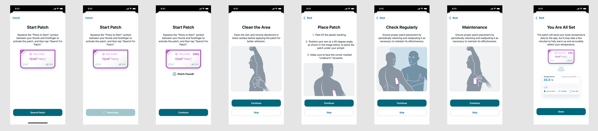
The following are the high-fidelity mockup wireframes for the remote new patient onboarding flow. This was a step-by-step manual that led the user to instructions on how to apply the temperature monitoring patch. We found that this persona did best with completing the task when the flow was broken down into small sections, including photos and validations.
Takeaways
I enjoyed learning about medical wearables and seeing how different parts of the software can communicate. My biggest takeaway about working on this project was finding ways to facilitate scanability on a data-heavy screen while prioritizing valuable information. I also realized how valuable user interviews are, regardless of the knowledge level of a platform. I learned so much from nurse practitioners on their current temperature monitoring process and ways to facilitate a more efficient digital experience.